Painting, Design, Repairs, De-cluttering, Sourcing and Murals.
"Rebecca did a wonderful job painting our two upstairs bedrooms and stairway. We really appreciated her artistic flair when it came to deciding paint colours. The finish was professional and she paid particular attention to detail.
We'd happily have her back and recommend her to anyone."
Mamadou & Polly, Leamington Spa
We'd happily have her back and recommend her to anyone."
Mamadou & Polly, Leamington Spa
Painting
I have been working as a painter and decorator in Leamington since developing my skills 'in the trade' under an exacting Dulux Decorator Assessor since 2016, before going independent in 2017. Though in fact I have been decorating homes for friends and parents for over 20 years but on a non professional basis.
As I am a fine artist colour theory and painting effects are natural to me. I do do illustration professionally but actually find decorating just as satisfying and it also allows me to paint my own paintings part time.
I take on jobs of all sizes and am happy to be left to it or alternatively if it is a bigger project to work closely with you and other contractors over a period of time to ensure your space is brought into its most lovely state of being!
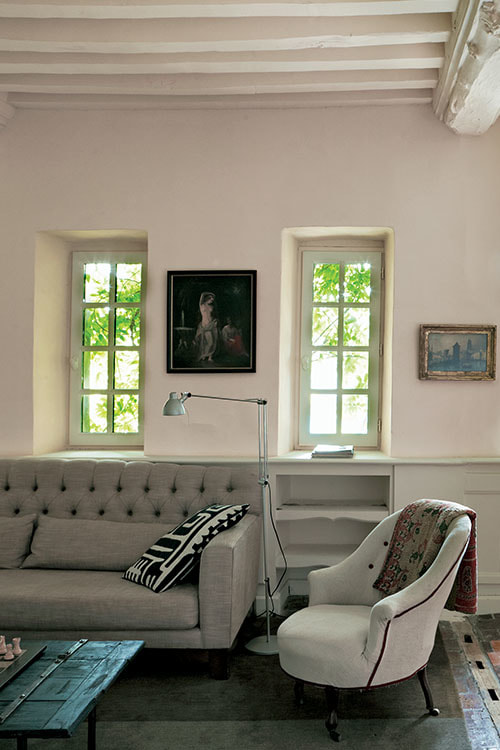
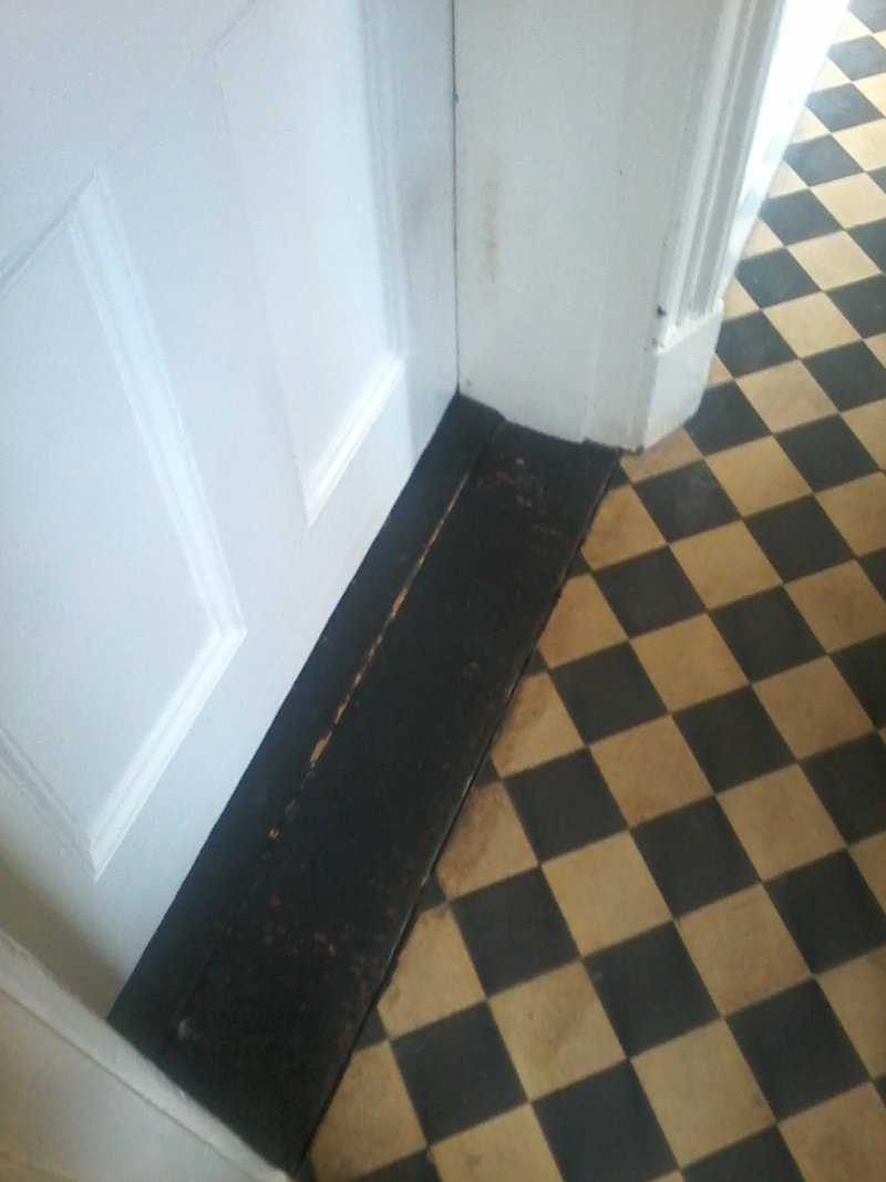
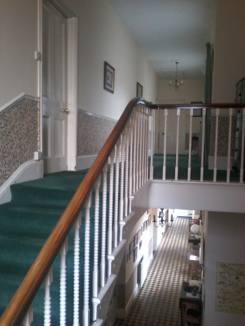
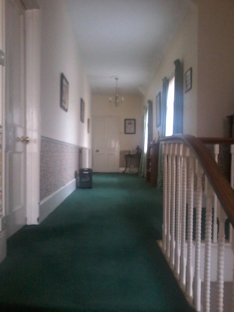
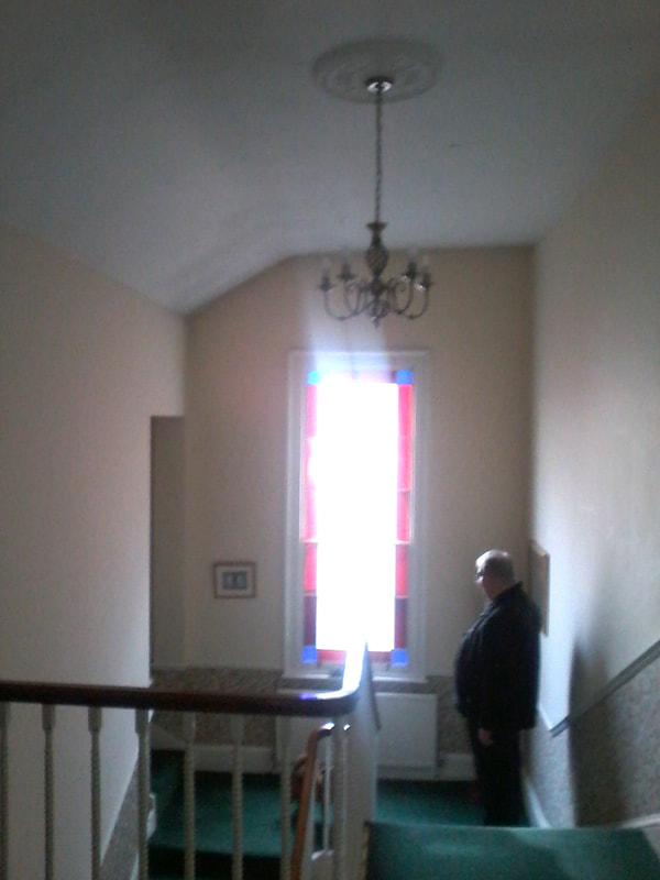
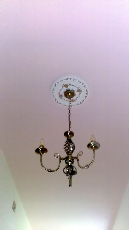
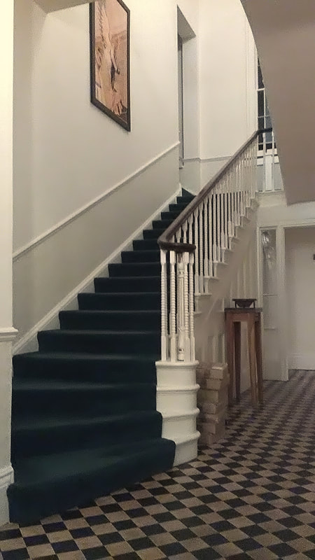
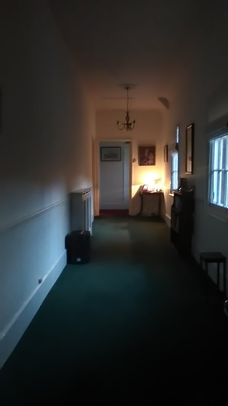
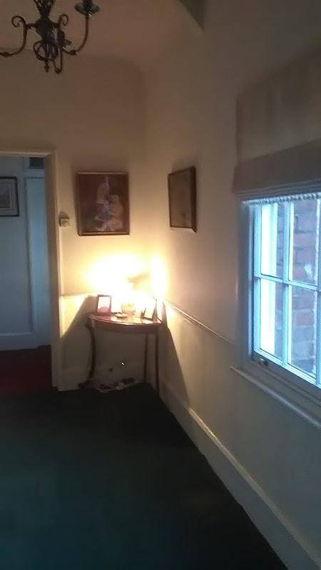
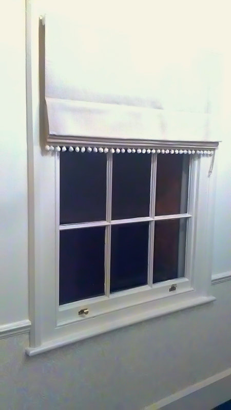
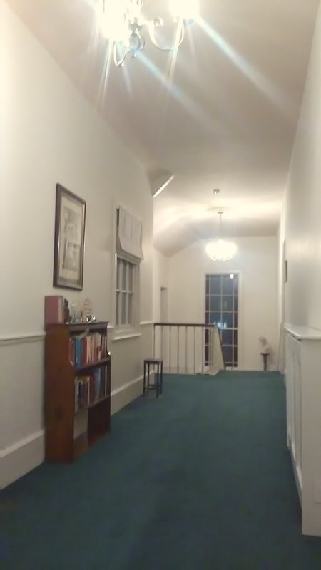
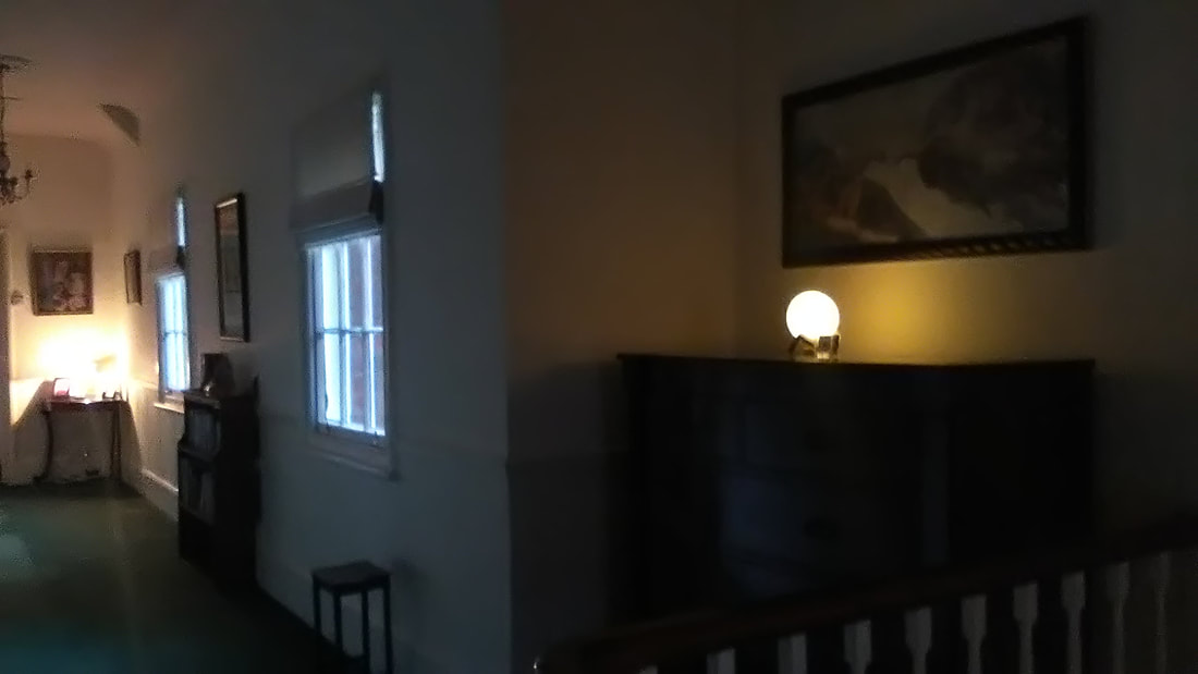
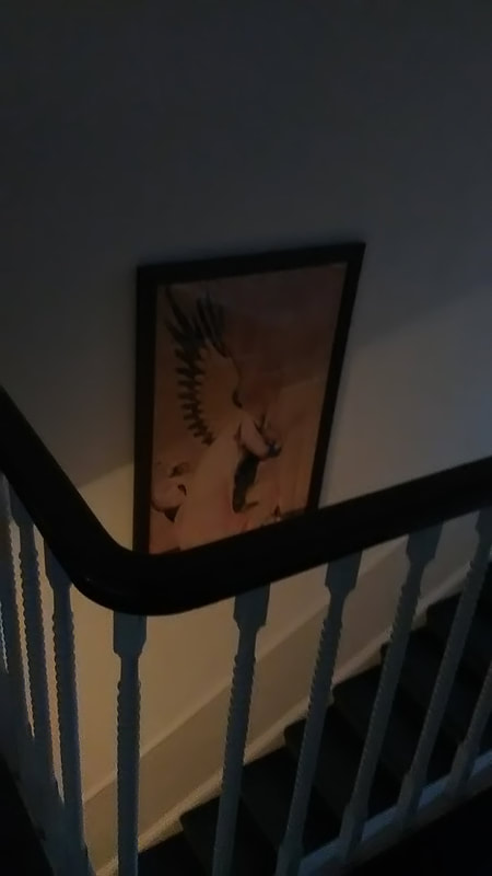
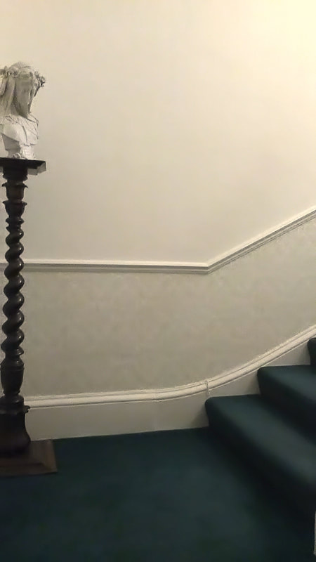
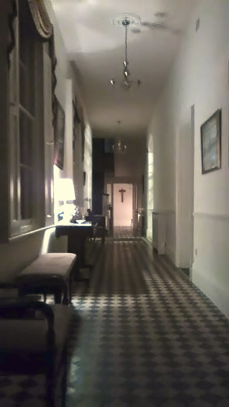
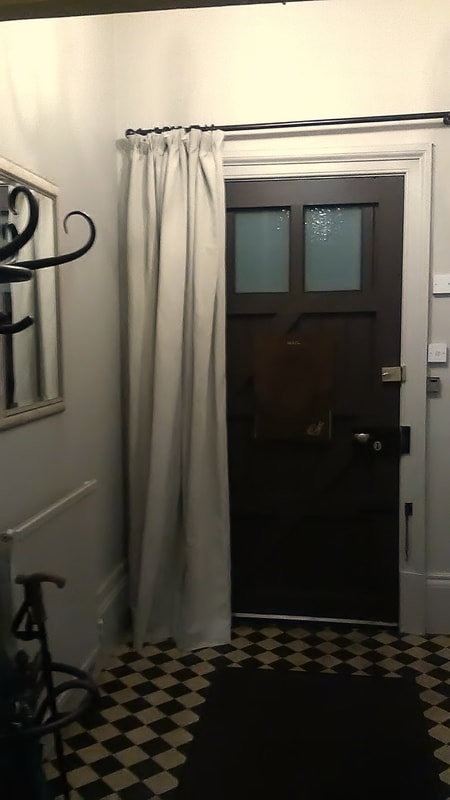
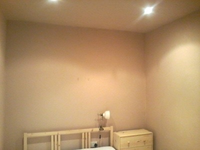
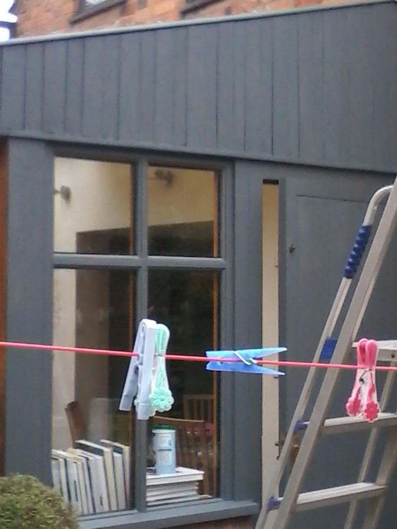
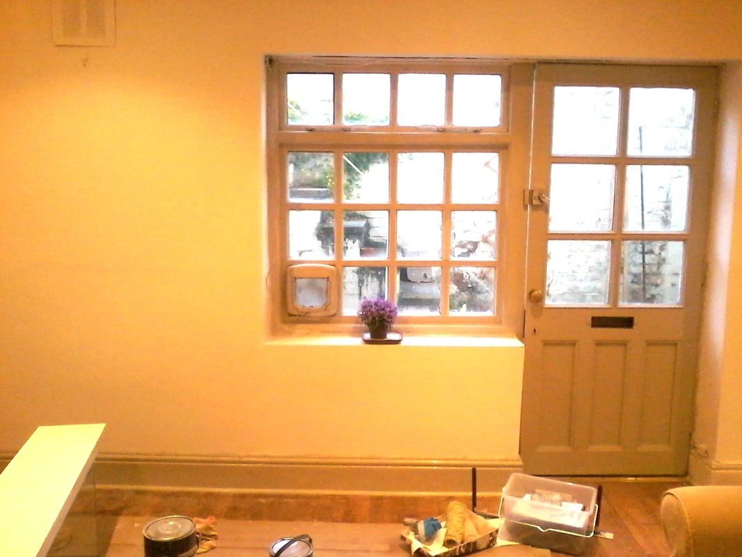
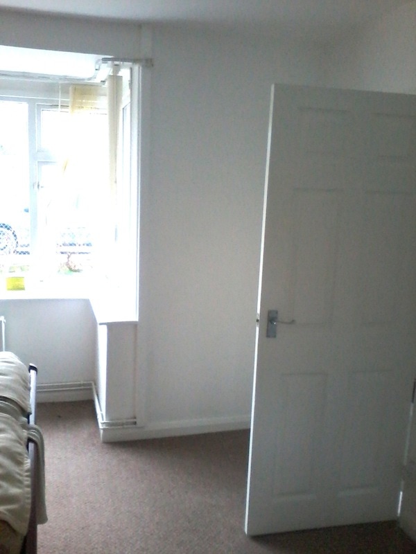
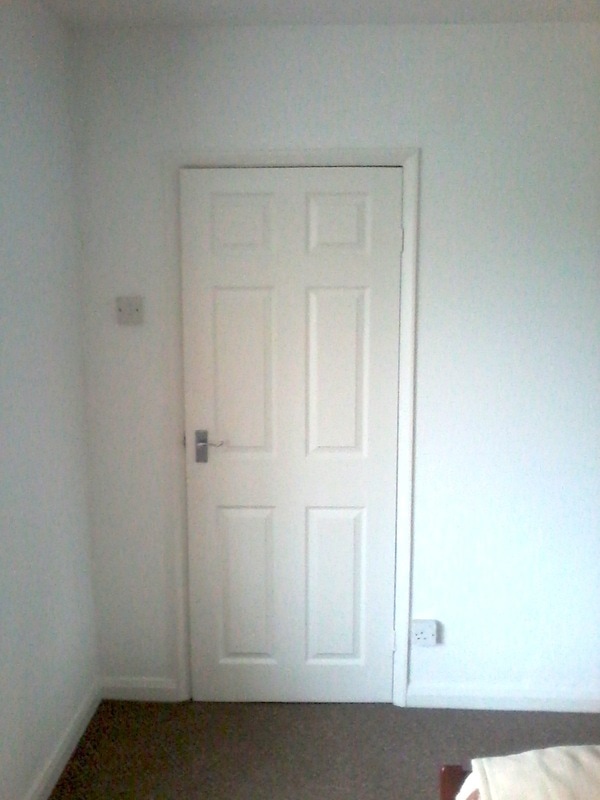
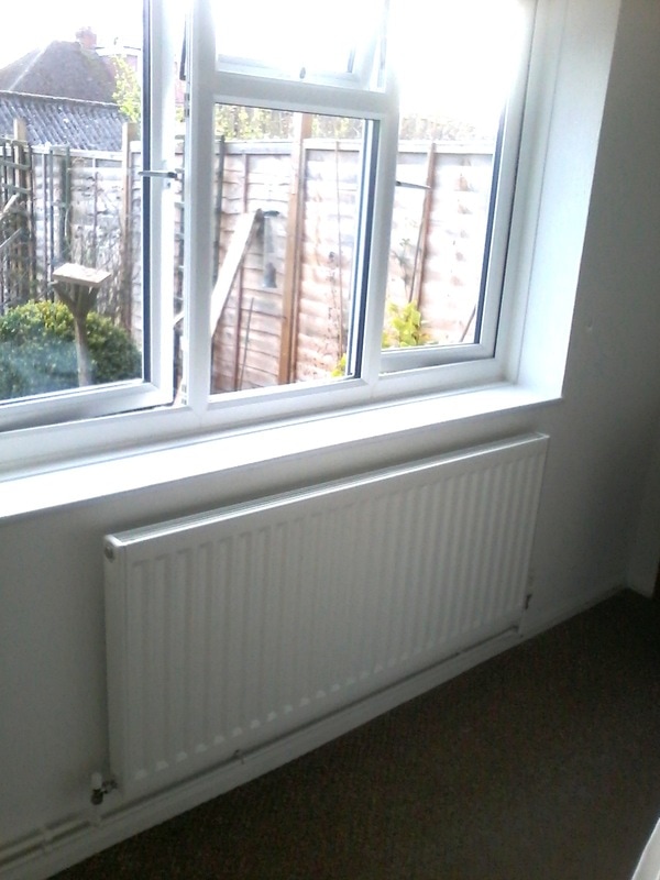
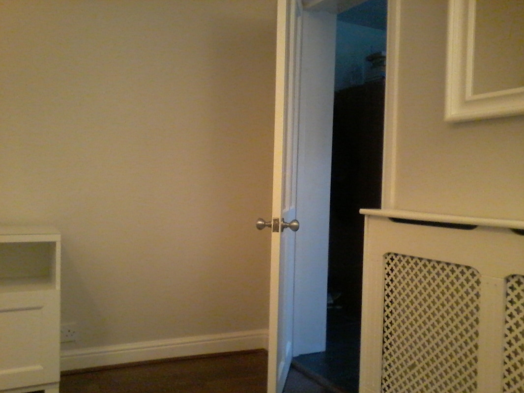
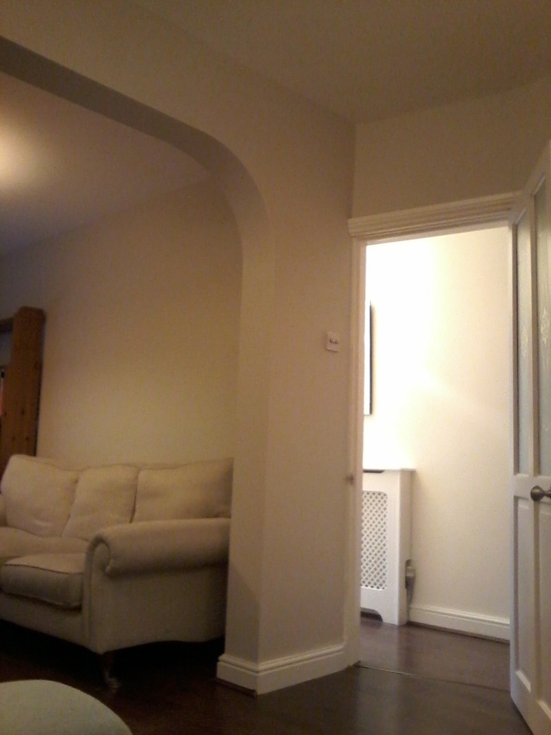
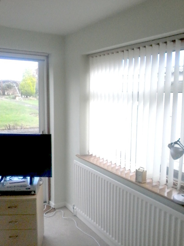
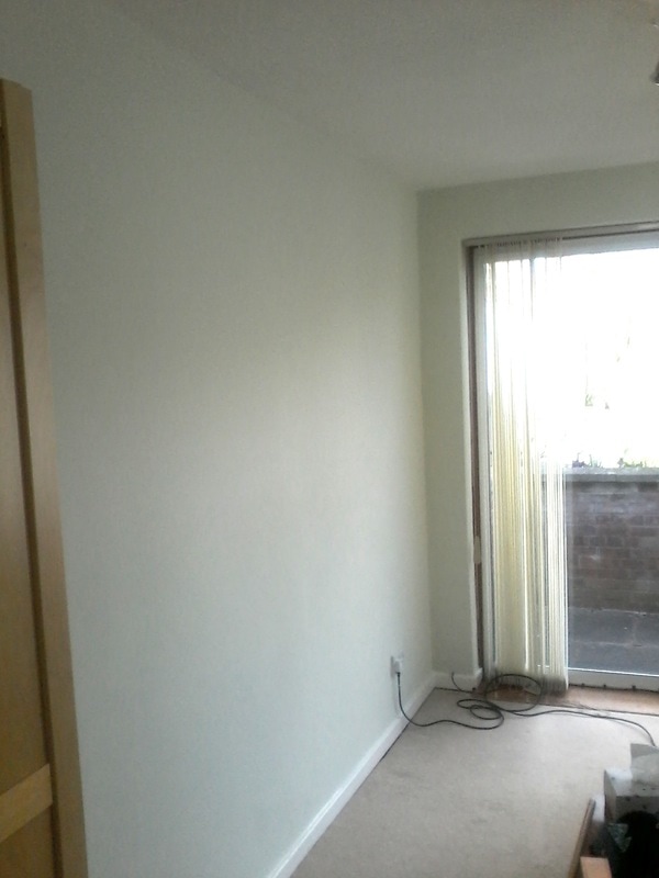
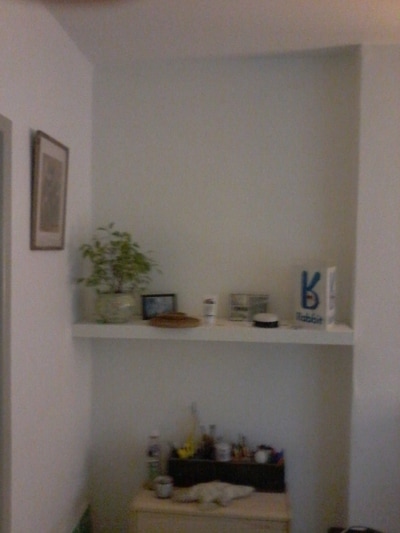
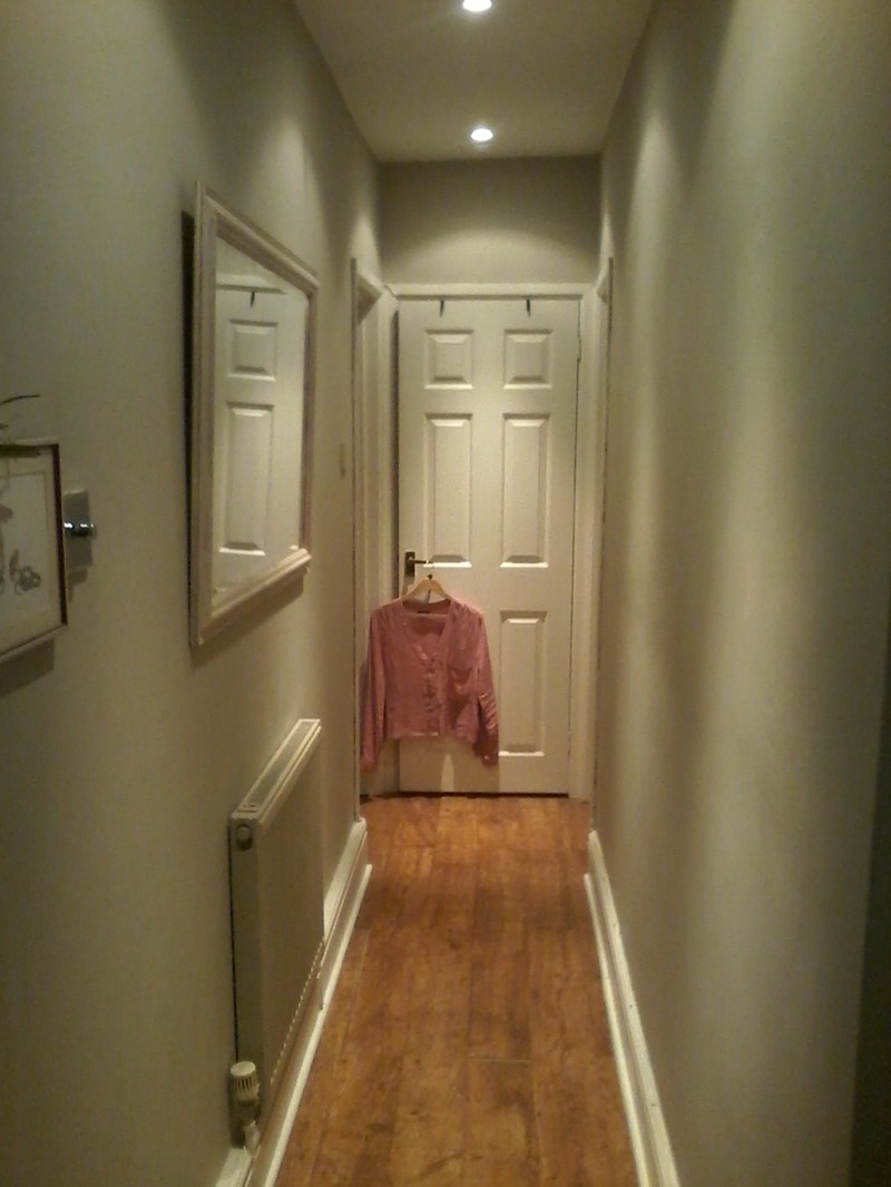
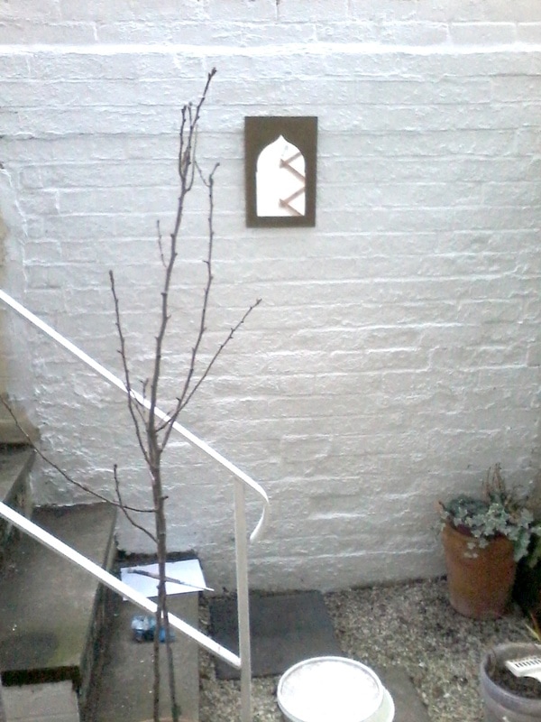
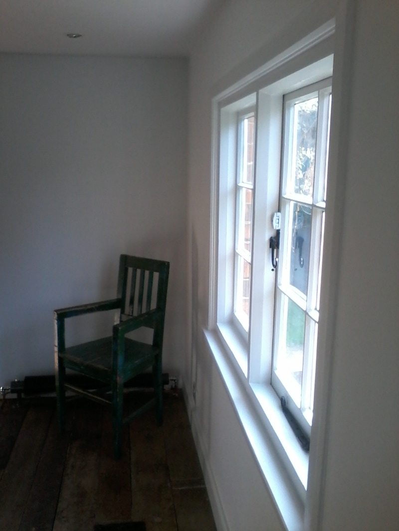
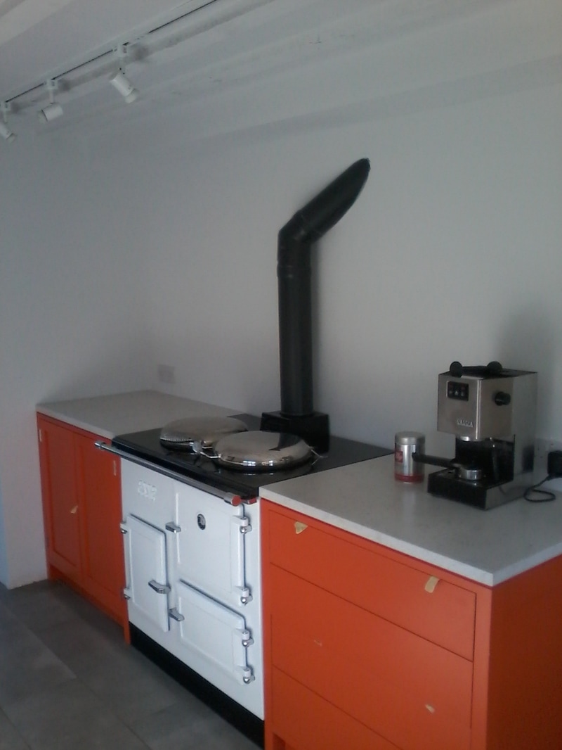
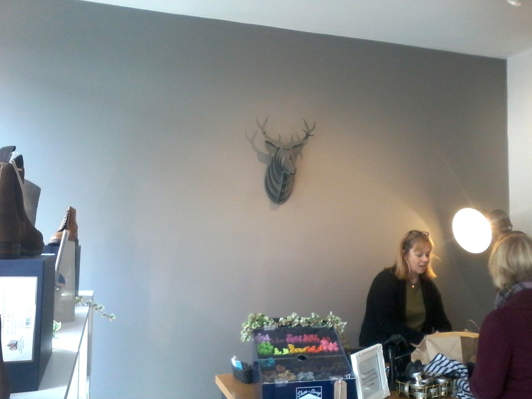
Here are some transformed spaces:
As I am a fine artist colour theory and painting effects are natural to me. I do do illustration professionally but actually find decorating just as satisfying and it also allows me to paint my own paintings part time.
I take on jobs of all sizes and am happy to be left to it or alternatively if it is a bigger project to work closely with you and other contractors over a period of time to ensure your space is brought into its most lovely state of being!
Here are some transformed spaces:


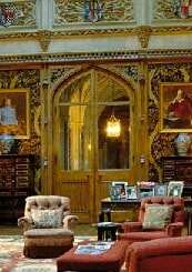
Colour and Design
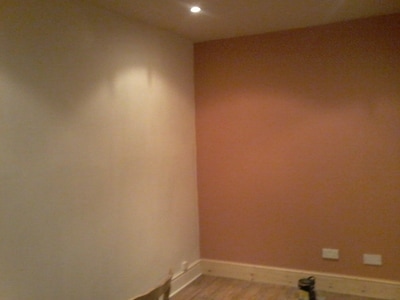
Choosing the right colour for your walls is not always easy. When the paint is spread across square meters, the effect changes and the colours intensify. It is also important to have colours which work well together in mood and tone. Lastly the shape of your room can be altered drastically by the placement of the colours depending on their shade - for example darker walls come in, lighter walls go out! The placement of the room in terms of sunrise and sunset can also affect the colour you choose altering it from cooler to warmer as the sun adds yellow or blue depending on the time of day.
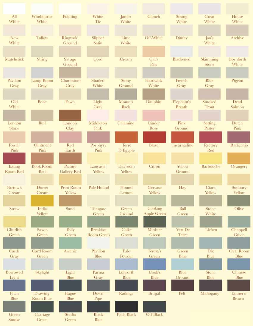
If you should require it, I can help you decide on a colour scheme and offer ideas for the enhancement of your property's features though the use of light and colour. I will bring a unique and harmony-enhancing palette to improve the overall aesthetic of your space.
Additional services
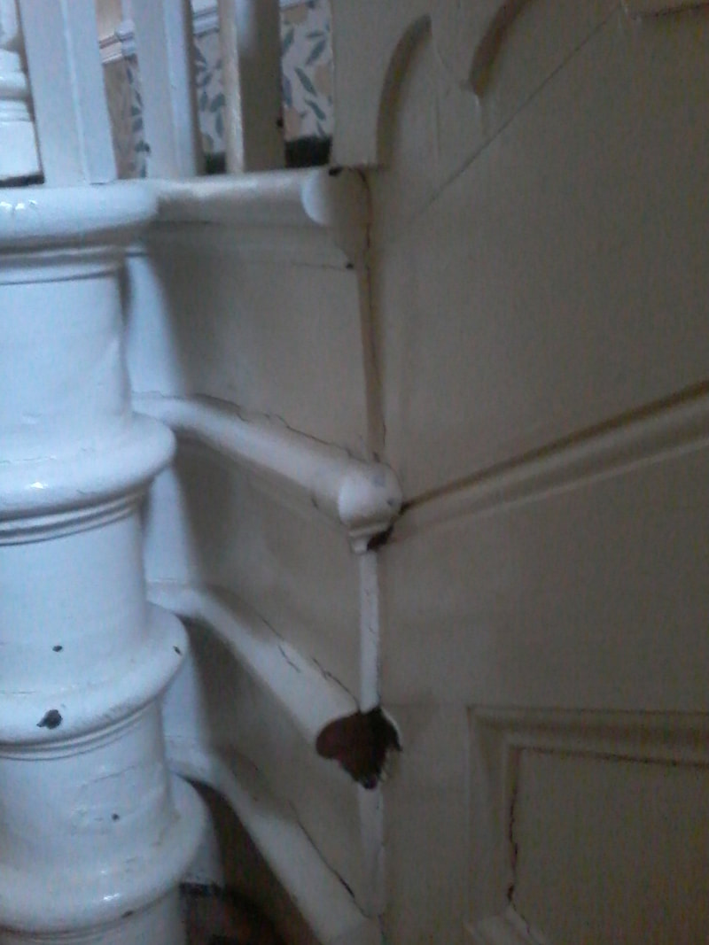
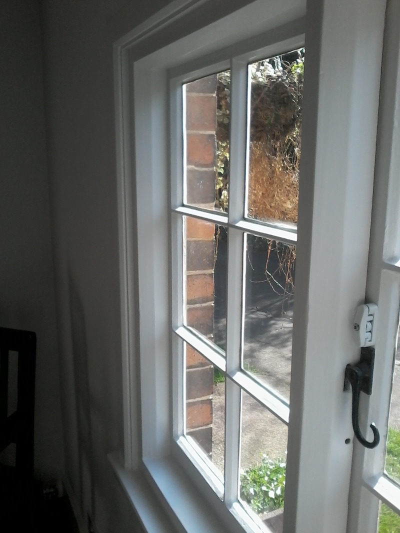
Repairs
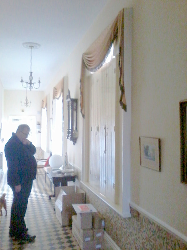
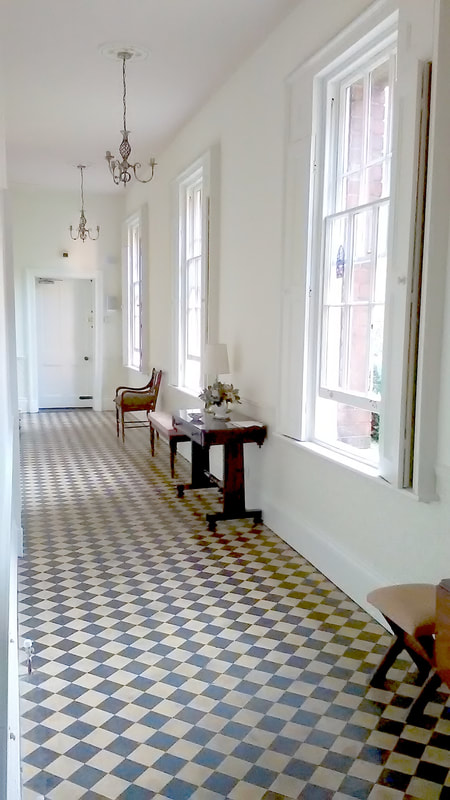
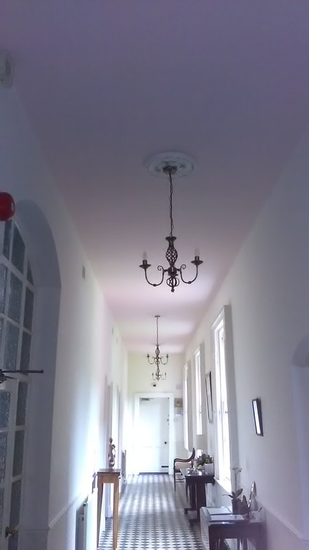
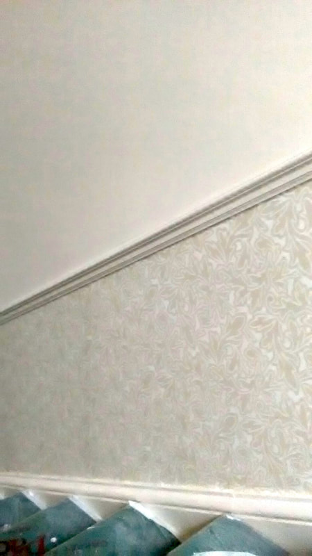
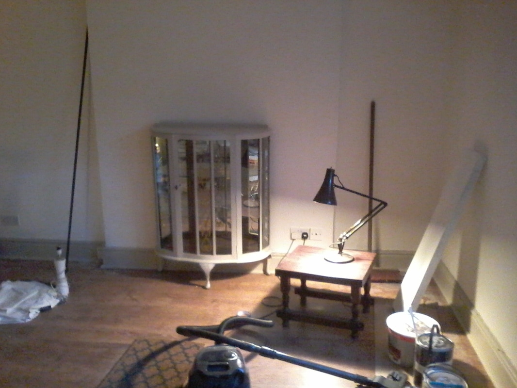
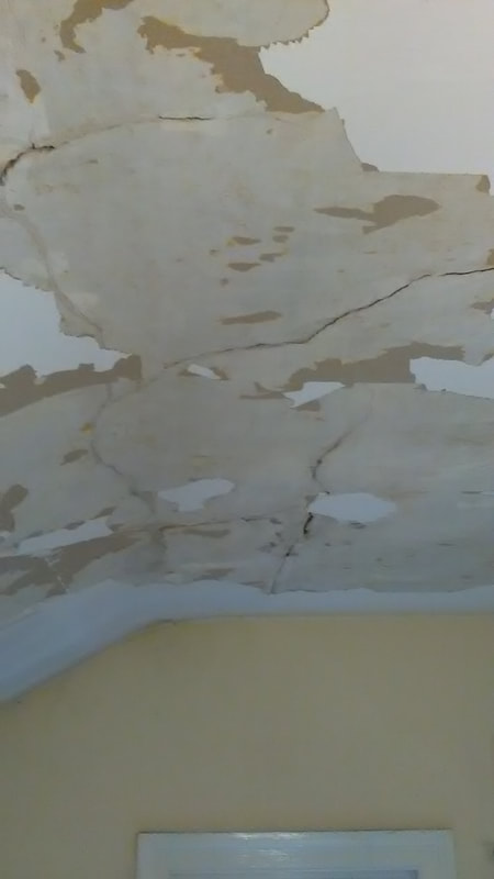
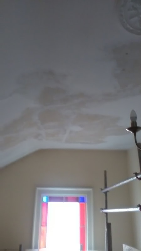
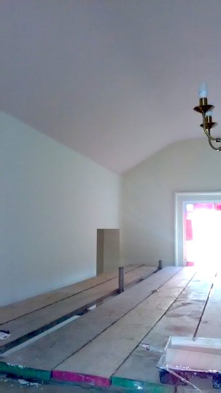
I am not daunted by holes in ceilings, gauged out chunks in walls or cracked and peeling window frames! In this case I undertook significant ceiling repairs, filling and actually skim-plastering the surface before priming and painting - photos before, during and after
Reorganisation and de-cluttering
We all put things down in a hurry, but do that over the course of a few years and you soon lose the peace and serenity your room once knew. Let me find it again for you.
We all put things down in a hurry, but do that over the course of a few years and you soon lose the peace and serenity your room once knew. Let me find it again for you.

Sourcing
In effect I will project manage a complex series of jobs and refurbish a property should it be required. I have a network of specialists who have proved their worth on previous jobs, that I can call upon as required, such as carpenters, scaffolders, plumbers, plasterers, window repairers and upholsterers. I will provide you with suggestions for and even put in place better lighting, suitable paintings and prints, fabrics, and all sundry items associated with making a house a home - of course all carefully tailored to you, your lifestyle and the period of your property.
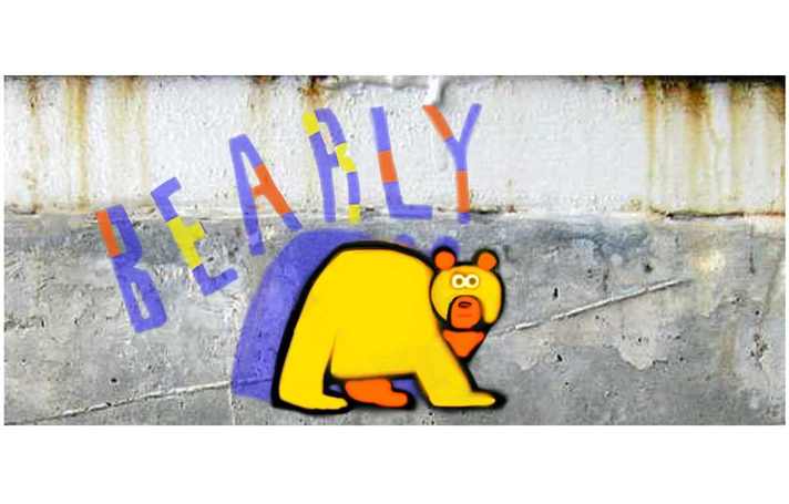
Murals
I can also offer to paint unique murals for a child's bedroom or other special place. Being an artist, I have plenty of inspiring ideas if you are open to them.